The last time I designed and coded a full website was back in 2009 using Adobe Flash. I built a lot of them before I shifted my focus to app development.
Now I’m finding my way back to that path, and I have to say, I really missed it. The creative process of building something from zero to completion is incredibly addictive. AI has also made certain parts much easier, especially writing the text content, which has always been one of my weaker areas.
This is what I’ve put together so far. It’s still a work in progress and hasn’t been optimized for mobile yet, so please test it on desktop only adn do not resize it the responsive part is not done.
I’m curious to hear your thoughts, and I’d also love to know how the performance feels on your side since I used shaders throughout the site as well.
1 Like
Nice!
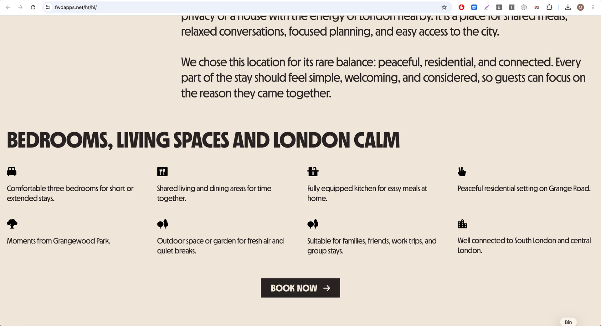
The image under the ‘Health Lodge Domain’ loaded slowly for me, and while it loaded, the page was blank and felt a bit broken. But after it loaded, things look really nice.
Also, there is a large white gap at the bottom of the page, nothing loaded there.
Performance wise, things move really well, working smooth.
1 Like
Thank you for the feedback… I will look into it.
The gap at the bottom I need to add two more sections faq and footer 
Nice work, I like it,
My only issue with it is that the default width is too wide for my screen and appears like it’s 100% width, 0 margins. That makes it a bit hard to read, especially in the text areas.
I’m on a 17’ macbook:
That is intentional only some section are full width some have a 20px padding , I went for full HD 1920px/1280px most modern computers have this minimum resolution now… but I kinda see what you mean not sure how to solve this becuase if I make it look proportional on your screenit will look too small on other screens
1 Like
I think one way to solve it is with CSS media queries, e.g. :
@media (max-width: 1024px) {

  .x { max-width: 900px; }

}
My macbook is relatively new, its resolution is 3600x retina something, but it does some weird scaling stuff, so it might scale it to 1800px, I’m not really sure.
LE:
Indeed it’s 1728.
I tried Zooming out 80-90% to 1920, and then it looks right
LE2:
I was curious how Apple handles this on their presentation pages. They have this kind of CSS:
margin: auto;
max-width: 2632px;
min-width: 980px;
width: 87.5%;
The width: 87.5%; is what does it.
1 Like
Thank you for the suggestion.
The client asked to look best on this resolution 1920x1080 it is also the most used resolution out there… I use media queries I have to see what I can do to optimize things abit for smaller resolutions.
I think adding a max-width container would make a big improvement to the overall look of the site. Right now, the content stretches too wide on large screens, which can make it harder to read and less focused.
.container {
max-width: 1200px;
}
1 Like